Tuesday, August 09, 2005


Comments:
<< Home

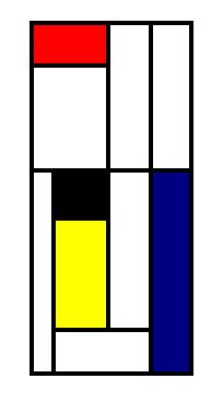
at first glance, i thought the first one was better since the white blended nicely with the surrounding primary colors. but then i noticed the bottom color is black, which seemed a bit dominating, and hmm.. i think mondrian's colors were more dominantly white (or bright) than black. so for the second na ako.
then again, the red yellow and blue squares seem to form an incomplete square because of the black square (prang tetris), so i think i'll go for the first one.
pinahaba pa sagot no. haha.
P.S. about ur tag pala sa blog ko, haha di naman sa mas cultured. i just happened to find one of his works very appealing so i googled him a bit, so i could make a supposedly mondrian-inspired blog. di successfu! ;P
and yeah, i was at the amsterdam airport in june, and luckily they had this small museum featuring artists from de stijl. cool kasi mondrian was the headline artist, so there was this good write-up and of course mondrian originals! mejo bitin ung works dinisplay though.
ang haba na! dapat vote lng sorry!:)
I have to admit I liked the first one more. Joseph does explain things well on the mondrian colors normally being worked around white, but the first one has a blend which really goes well.
third one. not just because i'm deviant by nature, but because it's soooo not in order. no flow, no blend- isn't a complete chaos but it's one waiting to happen. hahah.
Hi again,
In reply to your question at http://www.mars-hill.co.nz/blog/2005/07/wombling-free-melbourne-au.html - it's my day off, so I thought I'd waste some time hitting "next blog" and seeing where I showed up. There's a lot of rubbish out there, but you come across some great sites too.
In reply to your question at http://www.mars-hill.co.nz/blog/2005/07/wombling-free-melbourne-au.html - it's my day off, so I thought I'd waste some time hitting "next blog" and seeing where I showed up. There's a lot of rubbish out there, but you come across some great sites too.

nung una gusto ko yung 1st painting pero nung paulit-ulit ko tiningnan, mas maganda yung pangalawa kc parang maypagka void yung space ng white, parang kulang whereas sa 2nd, solid na solid yung colors. opinyon lang po
Post a Comment
Subscribe to Post Comments [Atom]
<< Home
